Tableau Project
This is a dashboard created by using tableau
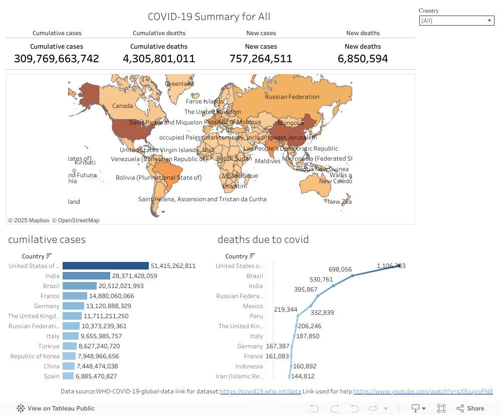
we have 3 graphs here :-
- The world heat map showing how many cases are there in each country
- A bar chart that shows the cumilative cases in each country
- a line graph that shows the deaths due to covid in each country
- and a method to see the summary for every country separately
the resources for this dataset is the WHO official website
WHO
the refernce was taken from youtube :
refernce
Home page